This page is to demonstrate my process, and to show difference between the three fonts.
Have some quick skip link things! Choose from them below:
← BackWhat access did I have to Generation B?
Below is the only reference image that I had access to for what Generation B looked like, this image is from the FontBros page for Generation B. I only used this image as a reference to ensure difference between the two fonts, and not as a base to trace from. Due to the fact that the characters used in the MLP:FiM logo are the smaller characters of Generation B, tracing from this image would actually be too difficult and not worth the time.

↑ Up
Want to see the differences?
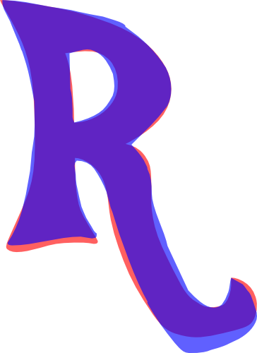
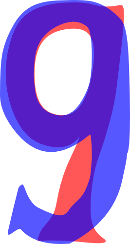
Below are two examples of the difference between the old Celestia Medium glyphs, and my Redux version. The old glyph is blue and is overlayed on the new glyph, which is red.
First is the glyph for 'R'. This particular glyph (and some others similar to it) is very distinctive, as such working it to look different wasn't easy.

It's worth noting here, that the differences on this scale are noticeable, however when shrunk to a much smaller scale, it's probably a difference of <1px.
Secondly is a glyph which I made very different to the old Celestia Medium version, '9', again blue is the old version, above the new red one.

Below is a side by side comparison of Generation B next to my Redux, I've not used all the glyphs as I think even this limited comparison shows there is a clear distiction. It shows the pairing twice, one at the size of the reference Generation B image, and one at double that size.

It's my hope that this section manages to stop anyone thinking I've tried to trace or copy Generation B, and to Hopefully stop the dubious history of Celestia Medium affecting the Redux.
↑ UpWant a finer look at the editing/creation process?
For the glyphs that were originally in the Celestia Medium font, I opened the .ttf in FontForge and exported each as an SVG file, this meant I could work them in a much nicer program: Inkscape.
Because FontForge seems to enjoy adding excess handles to it's vectors the first process to take place was to minimise the number of handles, and smooth out the shape of the glyph. This process alone changed the shape of most glyphs, and removed the flaws from them (some of which you can see the in the examples above). This alone however was not enough to make each glyph 'unique', so while smoothing the shape of the glyph I also started to change it to make them different to the original (this is also when I referenced the image of Generation B, so I could be sure I wasn't accidentically making them the same).
Once the original glyphs had been changed to the Redux version I imported them back into the FontForge file, and then generated a TrueType font (this was originally version 0.25 I think) and checked to make sure the characters 'worked'. Any edits that were needed took place, and then the process of producing new glyphs for missing characters began.
To produce new glyphs I usually had a look (if they're in) at the image of Generation B so I could form an idea of how I can make something inspired by it, but not replicated from it. As I began to move from the limited image of Generation B, I had a good understanding of how the font should 'feel' and so was able to produce glyphs not found in said image.
The process of making a new glyph usually started with finding an existing glyph and editing it to an entirely new shape, this just meant I had a good reference of the sizes and thickness of the lines invovled.
And that's the story of how Equestria was made. Maybe later I'll tell you about how I remade a font, it's a gem!
